CASK & EMBER
Branding - Packaging Design – Photography
Branding - Packaging Design – Photography
CASE STUDY
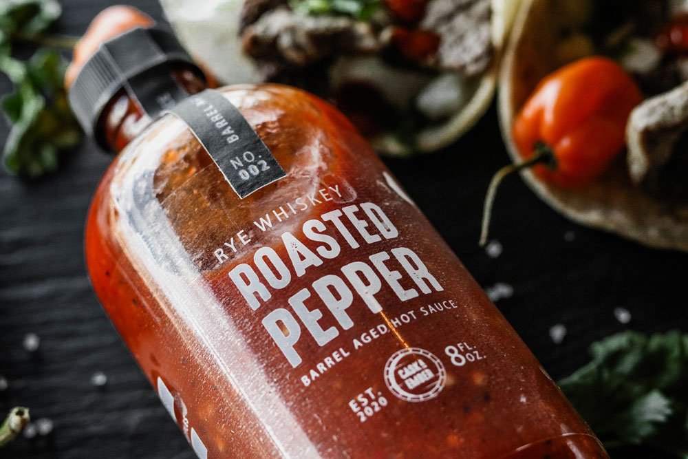
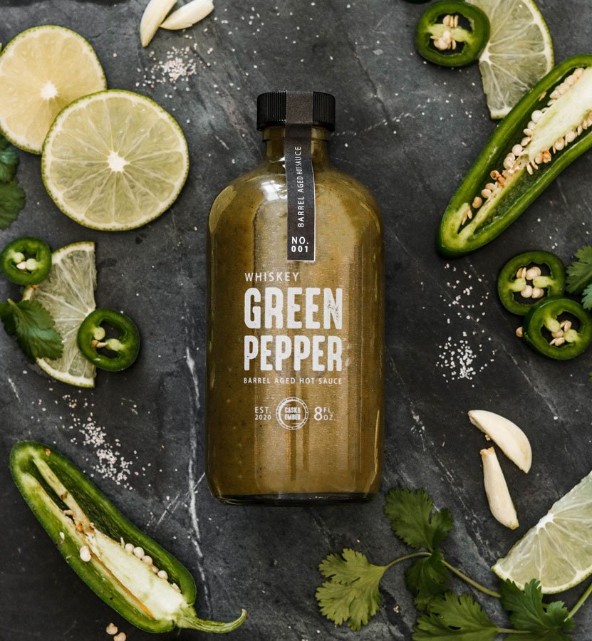
Cask + Ember is a barrel-aged hot sauce brand known for its one-of-a-kind flavors, with each batch crafted in a different barrel and never repeated. The packaging was designed to celebrate this exclusivity, allowing the rich, vibrant colors of the sauce itself to take center stage. The minimal design highlights the unique ingredients, creating a sense of authenticity and craftsmanship.
To further emphasize the small-batch nature of the brand, each flavor is identified with a distinct batch “NO.,” evoking the feel of purchasing from a curated collection. This thoughtful detail not only reinforces the brand’s exclusivity but also creates a connection with consumers looking for something truly unique. The final design reflects the brand’s rich, artisanal roots while standing out as a bold, modern product on shelves.