ZSPOT SKINCARE
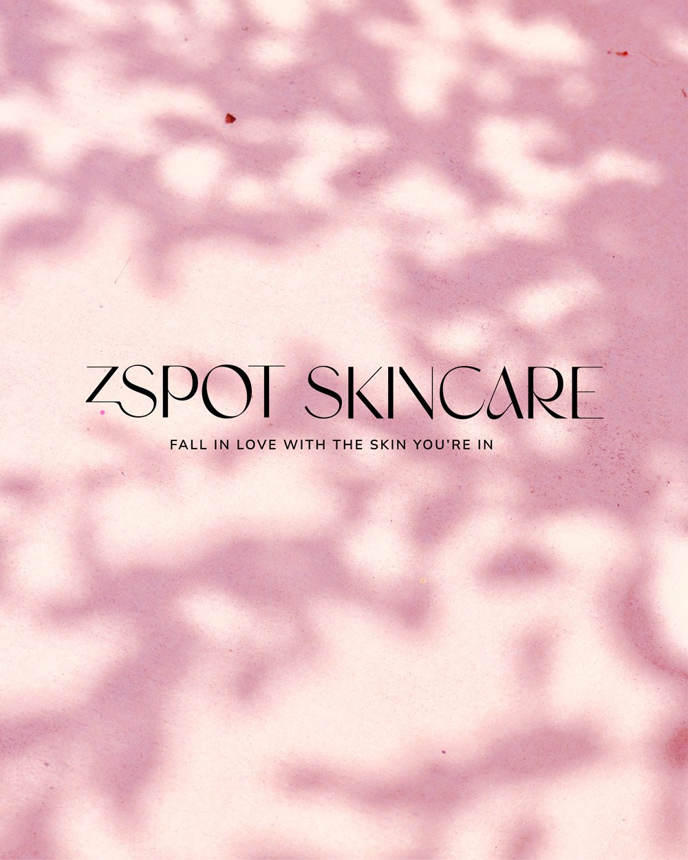
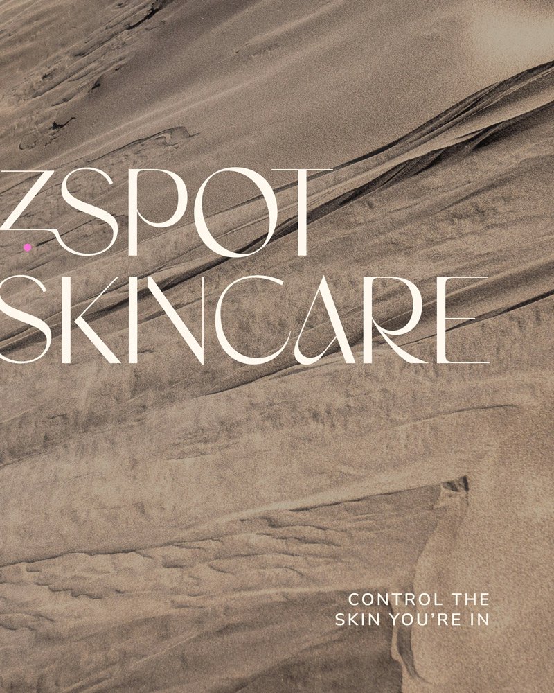
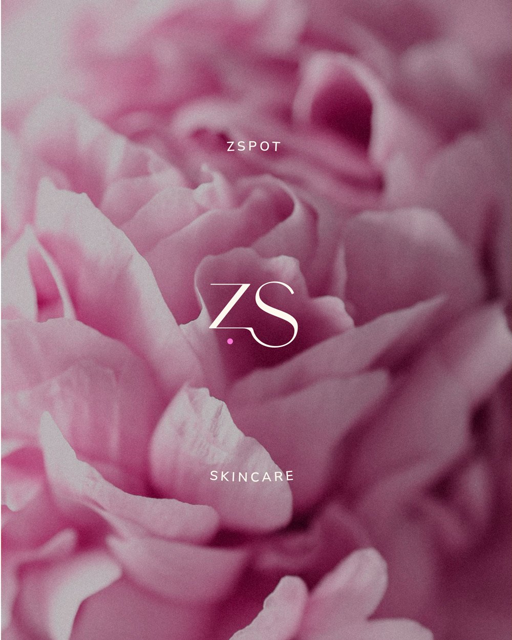
Visual Identity - Photography
Visual Identity - Photography
CASE STUDY
For this skincare brand refresh, the goal was to design a logo that seamlessly blended funky, groovy 70s-inspired aesthetics with a minimal, chic, and timeless appeal. The challenge was to infuse personality and playfulness into the brand while ensuring it remained sophisticated and enduring. By carefully selecting typography, color palettes, and subtle retro elements, the new identity strikes the perfect balance between vintage charm and modern elegance.
The final design captures the essence of the brand’s unique personality, making it feel fresh, fun, and effortlessly stylish. The refreshed logo not only stands out in the crowded skincare market but also maintains a timeless quality that will evolve with the brand. This new identity reflects the brand’s commitment to individuality while appealing to both nostalgic and contemporary audiences.